What Is Data Visualization?
This is the digital age, with digitization covering almost every business sector. Hence, a lot of information must be processed, displayed, and collected. It is very important for organizations to understand and communicate data effectively if they want their businesses to run efficiently.
One of the most important and powerful tools to achieve this is Data Visualization.
| Key Takeaways: |
|---|
|
In this article, we will cover the following:
|
This article will delve into data visualization in detail, explaining its importance, tools and techniques, benefits, and challenges it faces.
What is Data Visualization?
Data visualization is the graphical representation of information and data in visual elements like charts, graphs, and maps to understand data trends, patterns, and outliers.
Data visualization transforms complex data into a simpler form by representing it in a form that is more accessible and easier for humans to interpret. By translating complex data into visual stories, it effectively bridges the gap between data analysis and decision-makers.
This is beneficial when dealing with large, complex datasets or communicating insights to non-technical audiences.
What is the Purpose of Data Visualization?
Data visualization mainly intends to communicate information clearly and efficiently. The following are its main objectives:
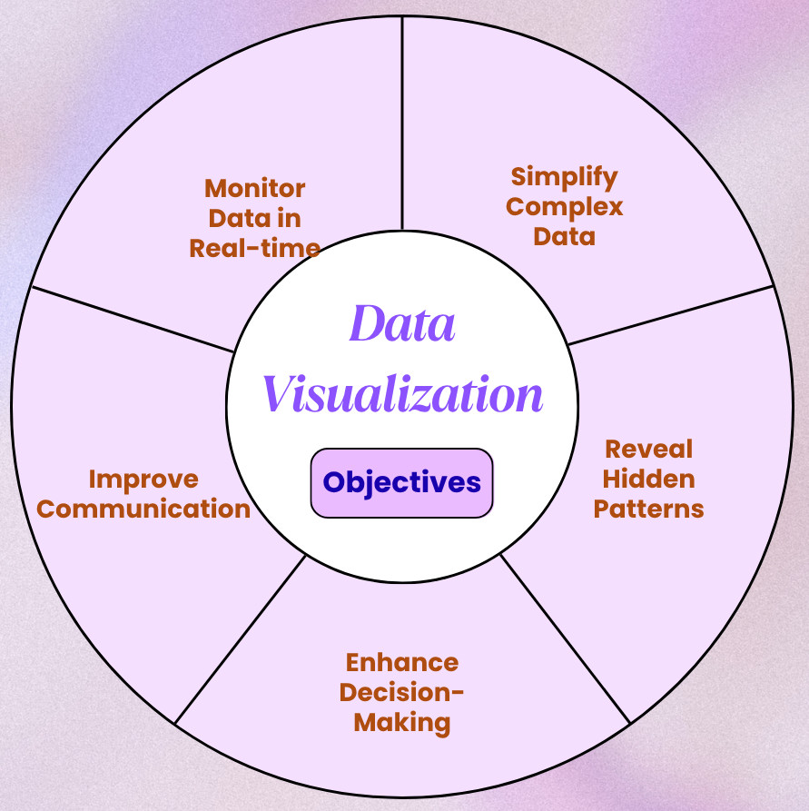
- Simplifying Complex Data: Interpreting large, complex datasets can be overwhelming, especially if the data is numeric. Data visualizations reduce complexity and help extract key insights by representing them in a visual format that is accessible and understandable.
- Revealing Hidden Patterns: When represented visually, trends, patterns, and outliers within the data become more apparent.
- Enhancing Decision-making: Businesses and organizations can make faster and more informed decisions with the right visualizations.
- Improving Communication: When data is represented visually, even audiences lacking a technical background can interpret the data.
- Monitoring Data in Real Time: Performance metrics with visual dashboards are more effective than text-based reports.
A Brief History of Data Visualization
The practice of data visualization dates back centuries, evolving from rudimentary cave paintings and maps to sophisticated digital dashboards of the present.
As computing power increased, especially in the late 20th and early 21st centuries, the capacity to process and display data dynamically also enhanced, paving the way for modern interactive data visualization.
The timeline for data visualization evolution is as follows:
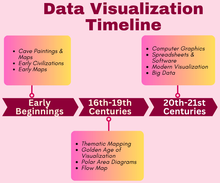
- Early Beginnings:
Early forms of data visualization mainly focused on spatial representation and navigation.
- Cave Paintings and Maps: This is the earliest form of data visualization and was used for navigation, hunting, and resource tracking.
- Ancient Civilizations: Egyptians, Greeks, and Babylonians used visual representation for land surveying, astronomy, and city planning.
- Early Maps: Maps like the Turin Papyrus Map (1160 BC) and the Roman road maps were used for navigation and resource management.
- 16th-19th Centuries:
This era saw the rise of statistical graphics and thematic mapping, and many important milestones in data visualization were achieved during this timeframe.
- Thematic Mapping: Thematic mapping emerged in the 17th century with Edmund Halley’s contour maps and William Playfair’s introduction of line graphs, bar charts, and pie charts in the 18th century. Playfair is known as the pioneer of statistical graphics.
- Golden Age of Visualization: The 19th century saw the advancements in thematic cartography and the development of techniques like bivariate maps (Jacques Bertillon) and dot maps (John Snow). This is considered the “golden age” of statistical graphics.
- Polar Area Diagrams: Florence Nightingale used polar area diagrams (a type of pie chart) to show mortality causes in military hospitals, influencing healthcare reforms in the 19th century.
- Flow Map: Charles Minard developed his famous flow map, which illustrated Napoleon’s Russian campaign. The map shows army size, location, temperature, and time, all in one visualization.
- 20th-21st Centuries:
Marked by advancements in computing, the 20th and 21st centuries witnessed the interactive visualizations and the democratization of data analysis tools.
- Computer Graphics: The emergence of computers in the mid-20th century enabled interactive and dynamic representations, further revolutionizing data visualization.
- Spreadsheets and Software: Tools like Microsoft Excel emerged in the late 20th century, making data visualization more accessible.
- Modern Visualization: The 21st century witnessed the rise of interactive dashboards, web-based visualization tools, and the growing importance of data literacy.
- Big Data: As Big Data evolved, the availability and volume of data increased manifold. This led to the development of more sophisticated data handling and visualization techniques for large datasets.
Types of Data Visualization
Data visualization consists of a vast array of techniques used to represent data visually. Common types include charts (bar, pie, and line charts), graphs (scatter plots and histograms), maps (heatmaps), and dashboards. Some tools also support an infographic that combines visuals and text.
Choosing the appropriate technique depends on the nature of the data and the story you want to narrate.
Here is a detailed summary of the data visualization types:
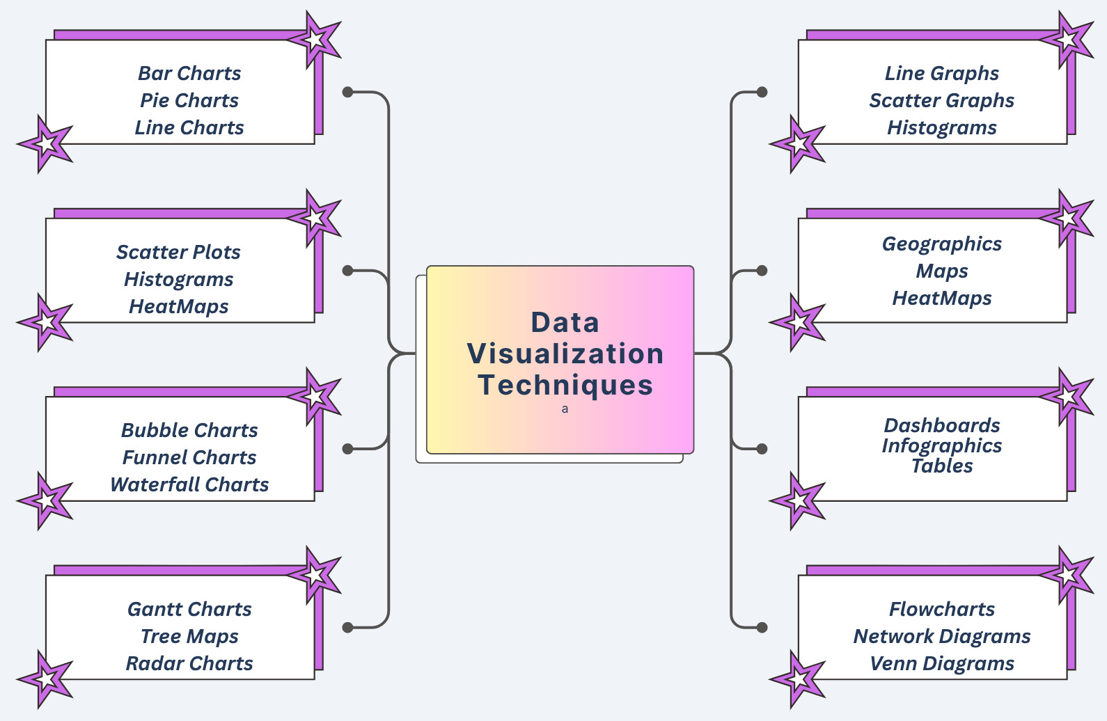
- Charts: Various types of charts used in data visualization include:
- Bar Charts: Used for comparing values for different categories or displaying changes over a period of time.
- Line Charts: Displays trends and changes in data over a continuous period of time.
- Pie Charts: Represent parts of a whole or proportions within a dataset.
- Scatter Plots: Visualize relationships between two variables, plotting how they correlate.
- Histograms: These display the distribution of a single variable and the frequency of data values.
- Heatmaps: They use color to represent data intensity or density.
- Bubble Charts: Combine scatter plots wherein the size of the bubbles represents a third dimension.
- Funnel Charts: Represent the stages of a process and the drop-off rate at each stage.
- Waterfall Charts: Display how a starting value behaves with positive and negative changes.
- Gantt Charts: Used in project management to visualize tasks, their duration, and dependencies.
- Treemaps: Represent data hierarchically using nested rectangles, where the size of each rectangle represents a value.
- Radar Charts: Compare multiple variables across different categories.
- Graphs: The following subtypes are used in data visualization:
- Line Graphs: Illustrate how a variable changes over time. Similar to line charts.
- Scatter Graphs: Show the relationship between two variables. Identical to scatter plots.
- Histograms: Visualize the distribution of data.
- Maps: The following maps are used for data visualization:
- Geographic Maps: Shows spatial patterns and relationships while displaying data on a geographical map.
- Heatmaps: Used to show the density of data points across a geographical area.
- Other Visualization Techniques:
- Dashboards: A single interface containing a combination of multiple visualizations for a comprehensive overview of data.
- Infographics: Combinations of visuals and text to present information in a visually engaging and informative way.
- Tables: A detailed representation of data in rows and columns.
- Flowcharts: Diagrams to visually represent processes and decision-making paths.
- Network Diagrams: Represent relationships and connections between different entities.
- Venn Diagrams: Illustrate relationships and overlaps between different sets of data.
Data Visualization Tools
Hundreds of tools exist today to create simple and complex visualizations, ranging from general-purpose software to specialized platforms. The following tables list some of the popular visualization tools:
| Tool/Platform | Description |
|---|---|
| Tableau |
|
| Power BI |
|
| Qlik |
|
| Zoho Analytics |
|
| Google Charts |
|
| Grafana |
|
| Flourish |
|
| Kibana |
|
| Bokeh |
|
| Matplotlib and Seaborn (Python libraries) |
|
| Microsoft Excel and Google Sheets (Spreadsheets) |
|
Choosing an appropriate data visualization tool depends on specific requirements, technical expertise, and budget. Factors such as the complexity of the data, the need for collaboration, and the required level of interactivity are also considered.
Principles of Effective Data Visualization
Data visualization is not just about creating graphs and charts. It is about narrating a compelling and accurate story. Effective data visualization is based on certain principles, such as clarity, simplicity, accuracy, and context, which ensure the message is communicated clearly and efficiently.
By following these principles, data visualizations created are not only visually appealing but also effective, helping users understand data, communicate information, drive insights, and facilitate informed decision-making.
- Clarity and Simplicity: Avoid unnecessary clutter and complexity and focus on essential information. Convey the key insights using consistent labeling, appropriate chart types, legible fonts, and minimal elements.
- Accuracy and Honesty: Ensure that the visualization accurately represents the underlying data. It should truthfully represent the data without any distortion or manipulation.
- Choosing the Right Chart Type: Select a chart type that is appropriate for the data and the message to be conveyed. For example, use bar charts for comparison, line charts for trends, and scatter plots for relationships.
- Strategic Use of Color: Highlight important information or distinguish categories using appropriate colors. But avoid using excessive or distracting colors.
- Providing Context: Add appropriate labels, titles, and legends to help the audience understand the visualization. In general, every visualization should be able to answer the “who”, “what”, “where”, and “why”.
- Audience Awareness: Align the visualization to the knowledge levels and requirements of the intended audience.
- Interactivity: Add interactive elements such as tooltips, zooming, or filtering so users can explore the data further.
- Accessibility: Ensure the visualization is accessible for all users, including those with disabilities.
- Data Density: Maintain an appropriate balance between displaying enough data and avoiding overwhelming the user.
Benefits of Data Visualization
- Improved Data Understanding: Visual data representation improves the understanding of data. This results in:
- Easier Comprehension: When data is presented in charts and graphs, it becomes easier for the human brain to grasp complex information than staring at rows of numbers.
- Pattern and Trend Identification: Visual representation of data helps identify patterns, trends, and outliers within the data that might be overlooked in raw data.
- Storytelling: Data visuals communicate the story hidden within the data more effectively than a plain text report.
- Enhanced Communication: Data visualization enhanced the communication between various stakeholders by providing:
- Accessibility: Visualizations make data more accessible to a wider audience, including those who may not be technically knowledgeable.
- Clear Communication: Graphical representation conveys complex information clearly and concisely, providing better communication.
- Effective Presentation: Data can be presented effectively using visualization, making it easier to share insights and findings.
- Better Decision-Making: Data visualization aids in decision-making as it helps with:
- Faster Decisions: Clear and concise visualizations help decision-makers quickly grasp key information and make more informed decisions.
- Data-Driven Insights: Visualizations reveal trends, patterns, and potential issues with the data that can be addressed proactively.
- Identifying Opportunities: Visual data highlights areas where opportunities and improvements may be needed.
- Improved Collaboration: It provides a common ground for discussion and interpretation of data, encouraging enhanced collaboration.
- Other Benefits: There are also added benefits of data visualization, as listed below:
- Interactive Exploration: Users can drill down into data, sort and filter information, and explore relationships between various data points.
- Reduced Time and Effort: Data visualization saves time and effort as it conveys information quickly, unlike raw data, which wastes precious time and resources in data analysis.
- Increased Agility: Data visualization provides real-time insights into data and helps organizations respond quickly to varying market conditions and customer requirements, thus increasing their agility.
Challenges and Limitations in Data Visualization
- Misleading Visuals: Poor design or deliberate manipulation can lead to misunderstandings, such as cherry-picking data, improper scaling, or misusing chart types.
- Over-simplification: In trying to make data simpler, it may lead to complexity as it may lose important information or variables.
- Data Overload: Too much data or visuals may overwhelm users, and the message may not be adequately conveyed.
- Accessibility: Some data visualizations may not be accessible to all users, such as those with disabilities. This should be an essential consideration during design.
Data Visualization in the Era of Big Data and AI
Thanks to AI and Big Data, organizations collect more data than ever, ranging from clickstreams and IoT sensor data to customer feedback. Data visualization becomes essential in this case for navigating this information landscape.
Big Data
Dealing with trillions of datasets requires scalable visualization systems. Tools like Apache Superset, D3.js, and cloud-integrated dashboards help visualize millions of rows efficiently.
Artificial Intelligence and Machine Learning
- Confusion matrices
- ROC curves
- Feature importance plots
- Neural network architecture visualizations
Future Trends in Data Visualization
- Augmented Analytics: AI-driven visualization tools to automatically generate insights, identify anomalies, or suggest the best tool type based on data.
- Immersive Visualizations: AR/VR environments for 3D data visualization in medical imaging, architecture, and engineering.
- Real-Time Dashboards: Live data streaming of finance, logistics, and cybersecurity data for monitoring operations.
- Storytelling Integration: Creating cohesive and persuasive presentations by combining narrative elements with data visualizations.
Conclusion
Data visualization is a fundamental and essential tool for understanding, communicating, and acting upon information. Irrespective of the profession you are in, the ability to visualize data effectively can significantly improve the outcomes.
As technology advances and data grows more complex, the demand for clear, insightful, and responsive data visualization will increase. Mastering data visualization skills is essential for anyone seeking to navigate the information era with confidence.
|
|